Join Our Email List!
Be the first to know about our latest special offers, promotions, company updates, and more!

As CPAP Supply USA approaches its 20th anniversary, we're on an exciting journey of change. For the last 19 years, our (now former) logo has been our guiding beacon, representing our dedication to providing our customers with top respiratory products and restorative rest. But as we entered a new era, we recognized the need to update our branding to better represent who we are, what we're trying to do, and what we stand for. Read on to learn more about the story behind our rebranding and the changes that lie ahead.
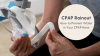
Original vs. New CPAP Supply USA Logo
CPAP Supply USA has grown and expanded over the years, welcoming new ideas and perspectives into its expanding team. As the healthcare industry continues to evolve and customers' needs change, the team recognized the need to communicate a clear message and position while keeping our logo fresh and memorable.
Old logo highlighting the “closed eye” sleeping concept
To those unaware, our previous logo featured an eye open and an eye closed, symbolizing the idea that our products offer a restful night's sleep that leads to a refreshed day. While we continue to focus on the importance of a good night's sleep for a brighter tomorrow, we decided it was time to modernize our execution. Our original idea was just getting lost in translation, so we needed to simplify, streamline, and communicate our vision better.

From bright blue and orange to a calming, modern purple monochromatic color palette
As part of the rebranding process, we’ve carefully chosen a new color palette that reflects our vision and what we want to make people feel. Moving away from industry norms, we embraced hues of purple. This is a deliberate choice as purple is both soothing and stimulating to the mind. Purple symbolizes a restful night’s sleep, but it also symbolizes a fresh, revitalized start when you wake up. It’s a fresh take on our original eye design, realized in a new, exciting way.
Our new logo
Our new logo is a testament to clarity and bold simplicity. It says it all - we're CPAP Supply USA and we're here to stay. In embracing the values of "less is more," our straightforward design reflects our dedication to transparency and connection.
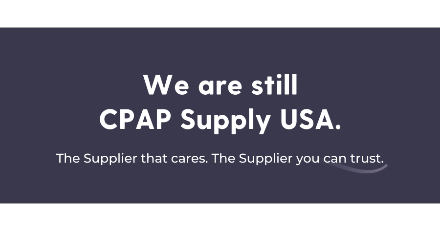
While many of the elements of our brand, including our logo, colors, fonts, design, and layout are changing, it’s important to remember that our company’s values remain the same. As we improve our brand, our unwavering commitment to exceptional customer service, personalized care, and unwavering support for our customers remains the same. We’re starting this rebranding journey with renewed vigor and excitement, ready to reach a new level of engagement with our audience.
We are excited about this new chapter in our company's history, and we thank you for your continued support along the way.
If you're interested in learning more about CPAP Supply USA’s story and our renewed company values, we invite you to check out our new About Us page.


Comments